07
Nezisková organizace pro pomoc pozůstalým
2025
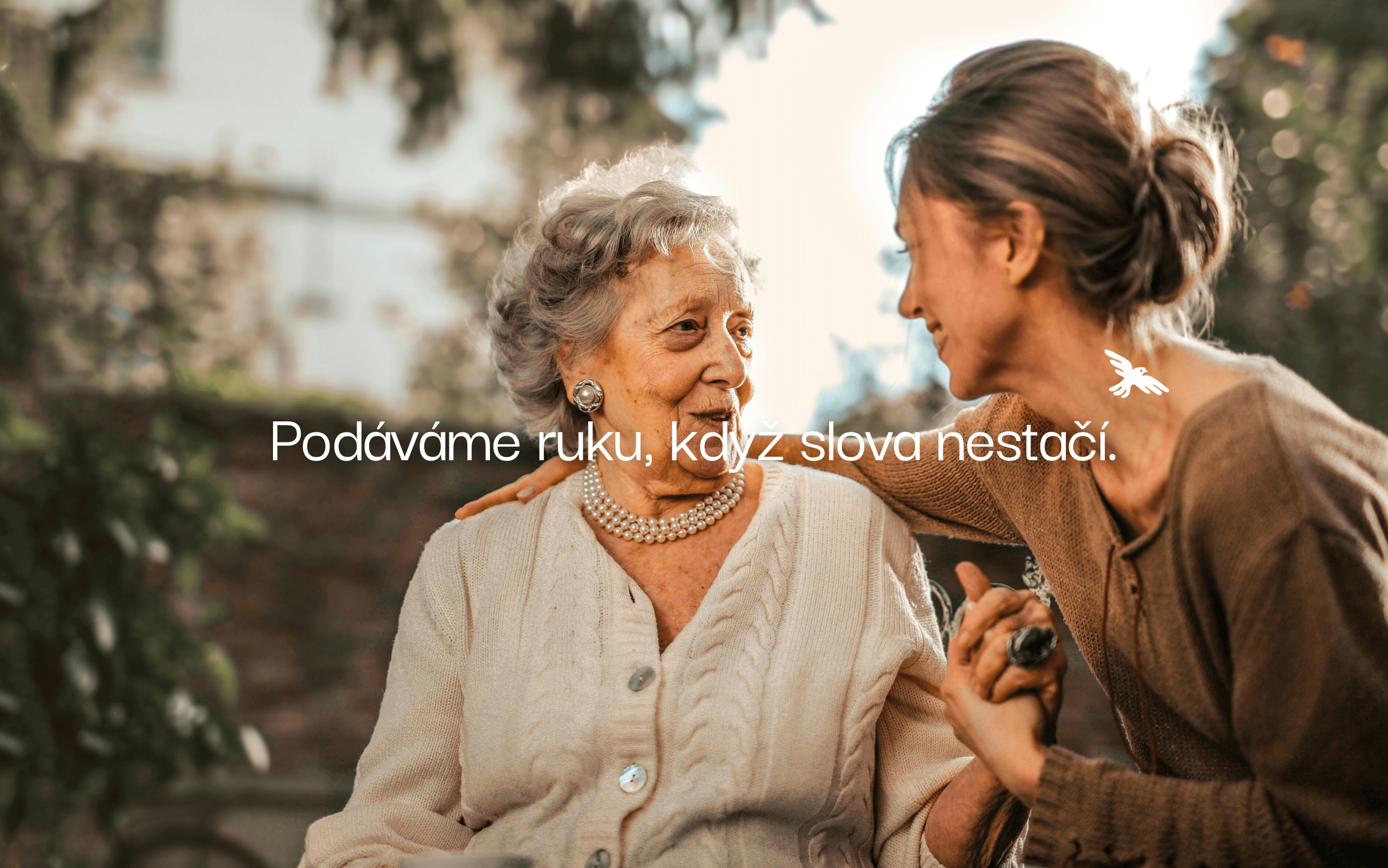
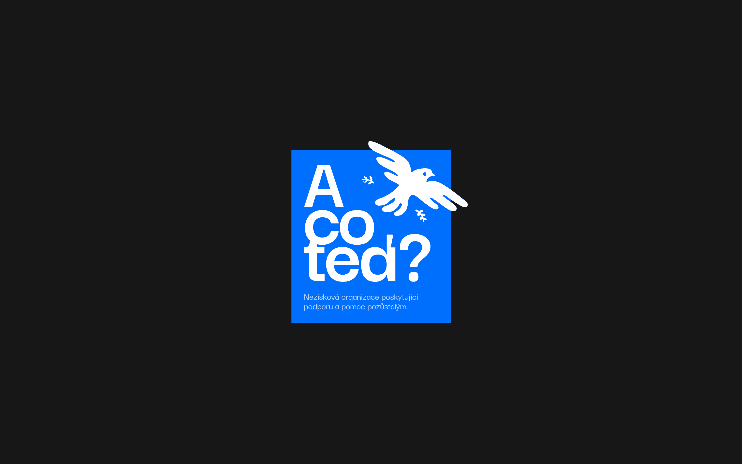
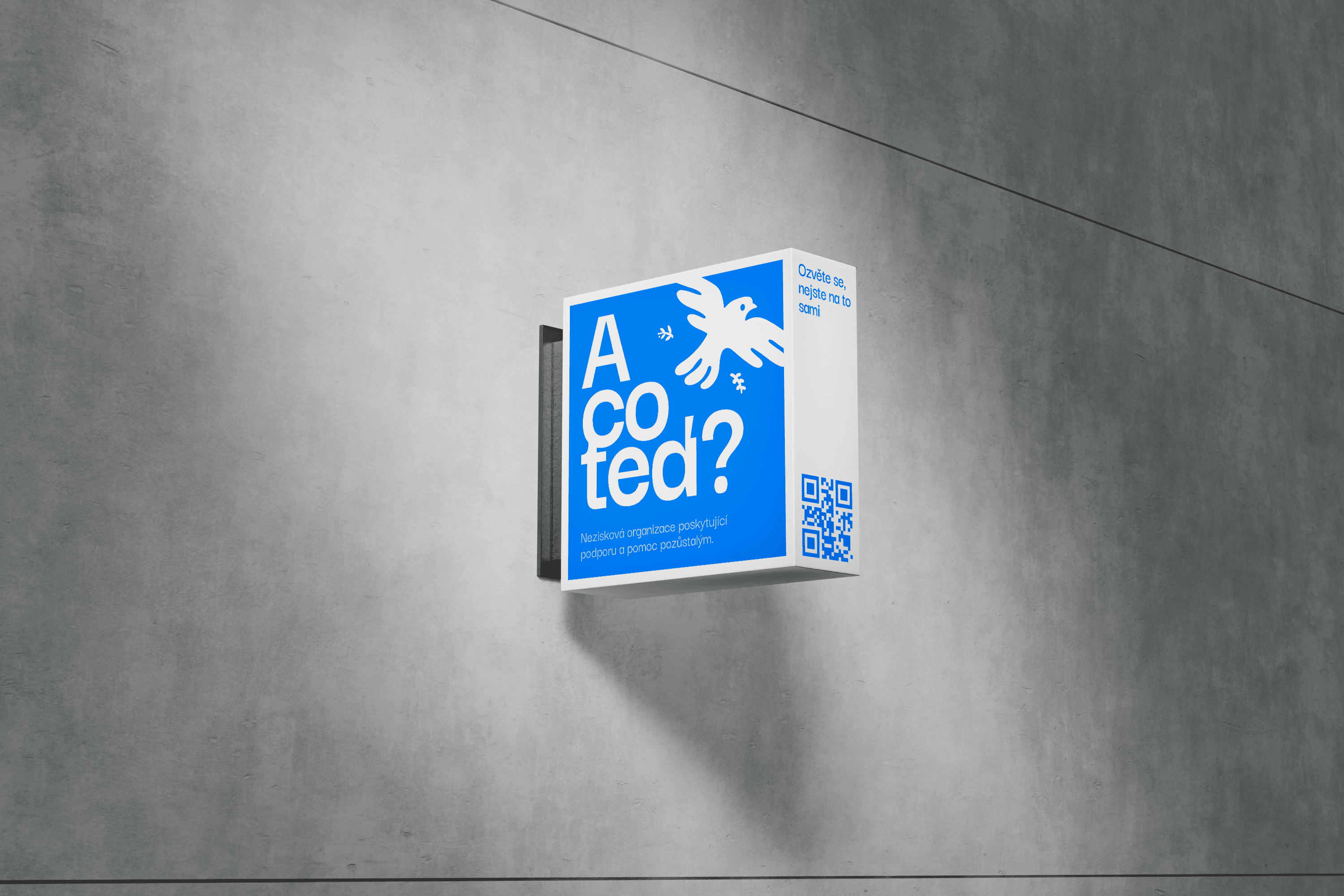
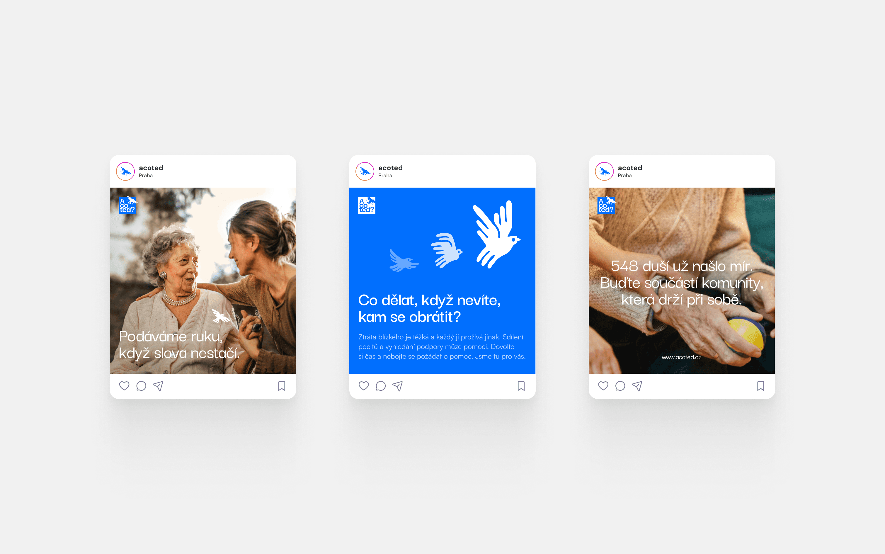
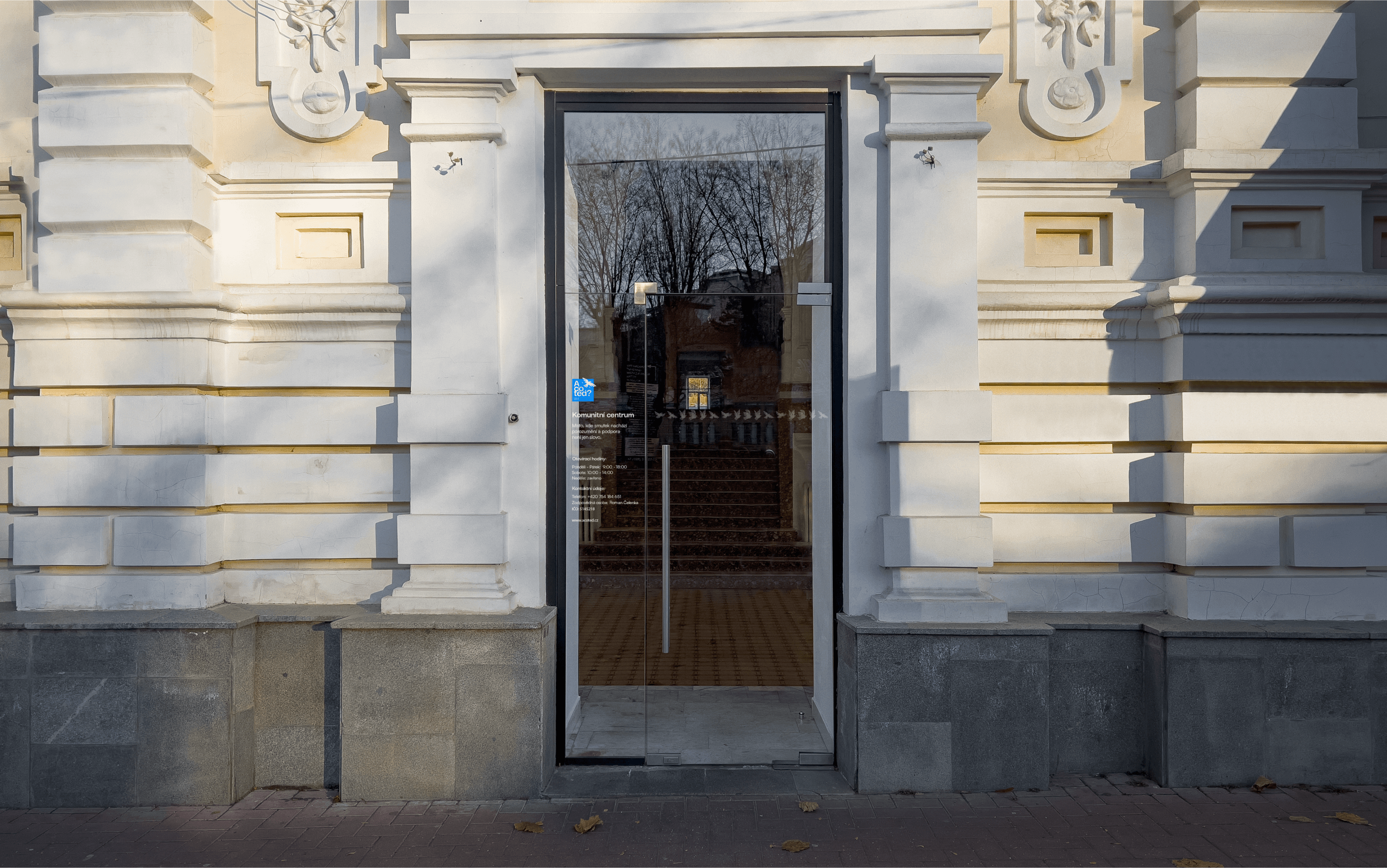
The brand identity centres on the direct, empathetic question “A co teď?” (“What now?”), the phrase many bereaved families instinctively voice when the funeral ends and reality sets in. Anchoring the logo is a vivid blue square—universally read as a colour of calm resolve and forward‑looking hope—into which the typography is stacked in an unapologetically large, humanist sans‑serif that feels as blunt and clear as the question itself.
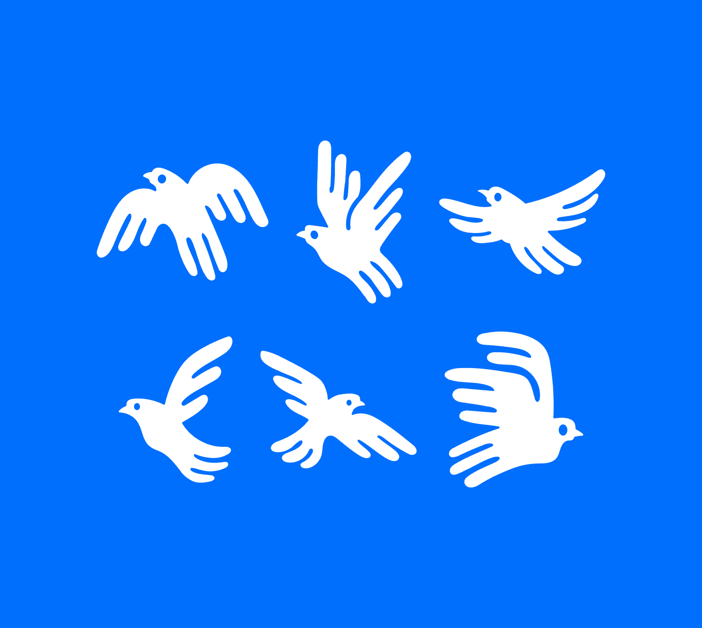
A white dove breaks the grid, its outstretched wings and gentle flight path signalling transcendence and the promise of support that rises above immediate grief. Together, the name, colour and symbol communicate that the association is not a distant institution but a ready companion, offering community gatherings, practical meetings and ongoing events that help mourners turn a moment of paralysis into the first step toward rebuilding their lives.
Client:
Nezisková organizace pro pomoc pozůstalým
Date:
2025
Role: